Undoubtedly, the online presence has become essential for every business regardless of its size and type to survive and thrive in the market. With technological progress and changing web design trends, the users’ preferences for website browsing has evolved from desktop to mobile. Modern website design trends create a demand for making the website packed with the latest trends that perform well on every device screen. However, making the website design responsive is often ignored which results in a poor experience and website abandonment.
- 57% of internet users say they won’t recommend a business with a poorly designed website on mobile.
- Nearly 8 in 10 customers would stop engaging with content that doesn’t display well on their device.
- According to Google, 61% of users are unlikely to return to a site on mobile if they had trouble accessing it, and 40% visit a competitor’s site instead.
- Alas! It’s not healthy for business growth and productivity. That’s why businesses have started emphasizing website redesigning or responsive website development that functions smoothly on all devices.
- 53.8% of web designers cite “not being responsive on all devices” as a top reason for a website to be redesigned.
The website redesign tips would help you know how to make your existing website mobile-responsive aptly. The businesses in the planning of building a website should not overlook baking a mobile-first approach in it as responsive website development is a must-have. However, making pixel-perfect responsive designs for all screen sizes is quite a task.
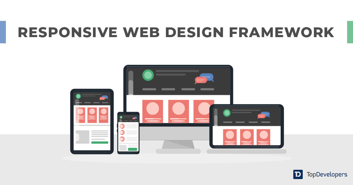
Thankfully, responsive web design frameworks iron out the issue by facilitating responsive web design crafting in reduced time while ensuring high quality. Let’s discuss the responsive design framework in detail.
What is a responsive design framework?
With gazillions of mobile devices available in the market, the responsive web design framework provides a basic structure with a bunch of features that are customized to suit device-specific design needs. With less complicated protocols, the framework is a complete package of standard codes in different languages that are required for website design.
It facilitates the developers to use the code rather than creating it from scratch which saves a lot of time and effort that goes into website designing.
Types of responsive website design frameworks
The responsive framework for web design comes in two varieties for front-end and back-end designing. They are-
Front-end framework
It’s essentially a CSS framework that’s built using the structure of files. They are mainly used for designing intuitive UI design by positioning elements simply and stylishly and resolving incompatibility issues.
Back-end framework
It’s a set of files in conjunction with libraries that’s leveraged for template structure, database access, and session management.
Tips to select the right framework for responsive web design
Comprehensiveness
The rookie players should go ahead with simple-to-understand responsive website design frameworks as they are easy to work with. If you have hands-on experience with responsive website design frameworks, you can select comprehensive frameworks.
Installation time
The framework with the least installation time takes less time to configure. Thereby the developers can start designing quickly.
Options they facilitate
Responsive web design frameworks come in a variety of different options for configuration, interface, and widget. You should look at them once.
Integration possibilities
Checking integration capabilities is all-important to ensure that framework works and integrates well with existing systems and applications.
Customer support
The uninterrupted customer service helps in getting timely updates to the framework and issues resolution whenever they pop up unexpectedly.
The benefits you can reap with the responsive design frameworks
Make designing effortless
The tools and packages come in the responsive framework eliminating the need to write the code snippets from scratch. The different templates pre-built in the framework facilitates customization that makes designing a breeze!
Strengthen security
Taking extra measures for web design security is no more required as the security methods and features built in responsive frameworks prevent fraudsters from database manipulation, SQL injection, and other vulnerabilities. Designers can count on a reliable framework’s security.
Resolve CSS problems
When the designers jump on the responsive website designing bandwagon, they face a lot of CSS problems that need to address individually. The framework as a readymade solution keeps all the problems at the bay.
Fasten mock-up development
The frameworks provide a common basic structure that all the websites have. Also, reduces the code length for responsive web designing, which speeds up website development. The designers can quickly build mock-ups.
Handle browser compatibility
Website designing often gets into trouble with browser compatibility as it requires designers to make extra efforts. The frameworks are designed in a way to handle browser compatibility fairly.
Popular responsive design frameworks leveraged worldwide
The framework does a spectacular job of creating responsive website design easily and quickly. It provides limitless columns across a page and facilitates scalability to any width leveraging percentages. Putting content on the top priority enables developers to make the grid suit the content. The mobile versions of the grid come pre-built in the package which makes starting easier.
It ensures seamless integration with existing HTML or CSS that makes responsive website creation hassle-free. Fluid columns allow developers to make the website mobile responsive with clean and concise design in reduced lines of code.
It’s an extensible and powerful framework that comes with a front-end toolkit to build responsive websites. The modular and custom architecture built using SaaS allows developers to import the components required, and write CSS with maps, functions, variables, and others. The responsive framework also facilitates building and extending variables for utilities, global themes, font styles, colors, and others in real time.
Adding, modifying, and removing utility class becomes effortless with utility API addition to the Bootstrap framework. The framework enables responsive utilities, custom naming conventions, and pseudo-class variants. What’s more? If you want to add popovers, modals, or tooltips, Bootstrap facilitates the same without using jQuery. JS plugins make it possible.
The lightweight framework helps in creating a responsive website with less than 400 lines of code while keeping mobile users in mind. With standard HTML elements and a grid, it provides all the utility of a larger framework and enables developers to get started with small projects. 12-column fluid grids with a maximum of 960 pixels facilitate shrinking the grid as per the device size or browser type.
Simple syntax and responsive coding enable changing the grid in one line of CSS.
The styles have made forms easier to create. Media queries are leveraged to serve scalable grids, list queries used for website styling across all the devices, and mobile-first queries for organizing CSS.
The responsive framework is built with a mobile-first approach and enables building responsive website design that works well across all browsers. The modular code facilitates independent modules that allow developers includes what’s required. The workflow is automated using Parcel JS config.
With everything coming in a package, the developers don’t need to spend much time on overriding styles and can build elegant website designs with minimal code. The basic styles are set as a Base framework built on top of Normalize.css.
The Semantic framework enables developers to make websites that speak the language of users with intuitive UI designing. It allows responsive website design engineering with concise HTML where words and classes are used interchangeably. The framework uses simple phrases to trigger functionalities.
When the team found performance is not up-to-the-par, Semantic helps in tracking performance bottlenecks without digging in depth into the code. With more than 3000 theming variables and over 50 UI components, the developers get the freedom to play with design and come up with unique designs. More than 5000 open-source projects built using Semantic UI help developers get the required assistance.
Takeaway
Responsive website design is a need of the hour that no business can afford to overlook at any cost. At the same time, it’s not an easy endeavor. That’s where a responsive web design framework turned out as the best solution that meets the mobile-friendliness needs of business website projects. With the benefits and best frameworks shared, you can use the tips to find the best responsive framework that’s a good fit for your project.
Also, when you partner with one of the top web design companies, they recommend the right frameworks that ensure quality and help you get the responsive website built in a reduced time.
Avantika Shergil
| Sep 16, 2022


An enthusiastic Operations Manager at TopDevelopers.co, coordinating and managing the technical and functional areas. She is an adventure lover, passionate traveler, an admirer of nature, who believes that a cup of coffee is the prime source to feel rejuvenated. Researching and writing about technology keeps her boosted and enhances her professional journeying.
Leave a Reply